

Find out how the avant-garde twitch platformer got its distinctive look
Hello again! We’re back with another blog post; this time we thought we’d talk about one of the new things we’re most happy with in N++, the graphics.
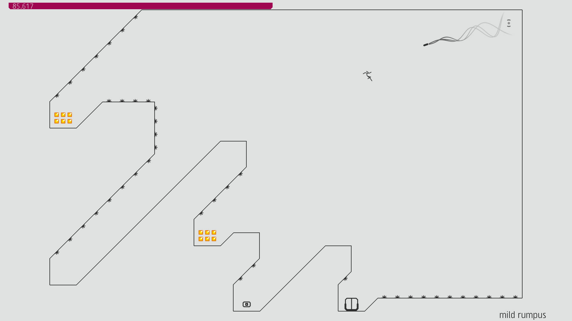
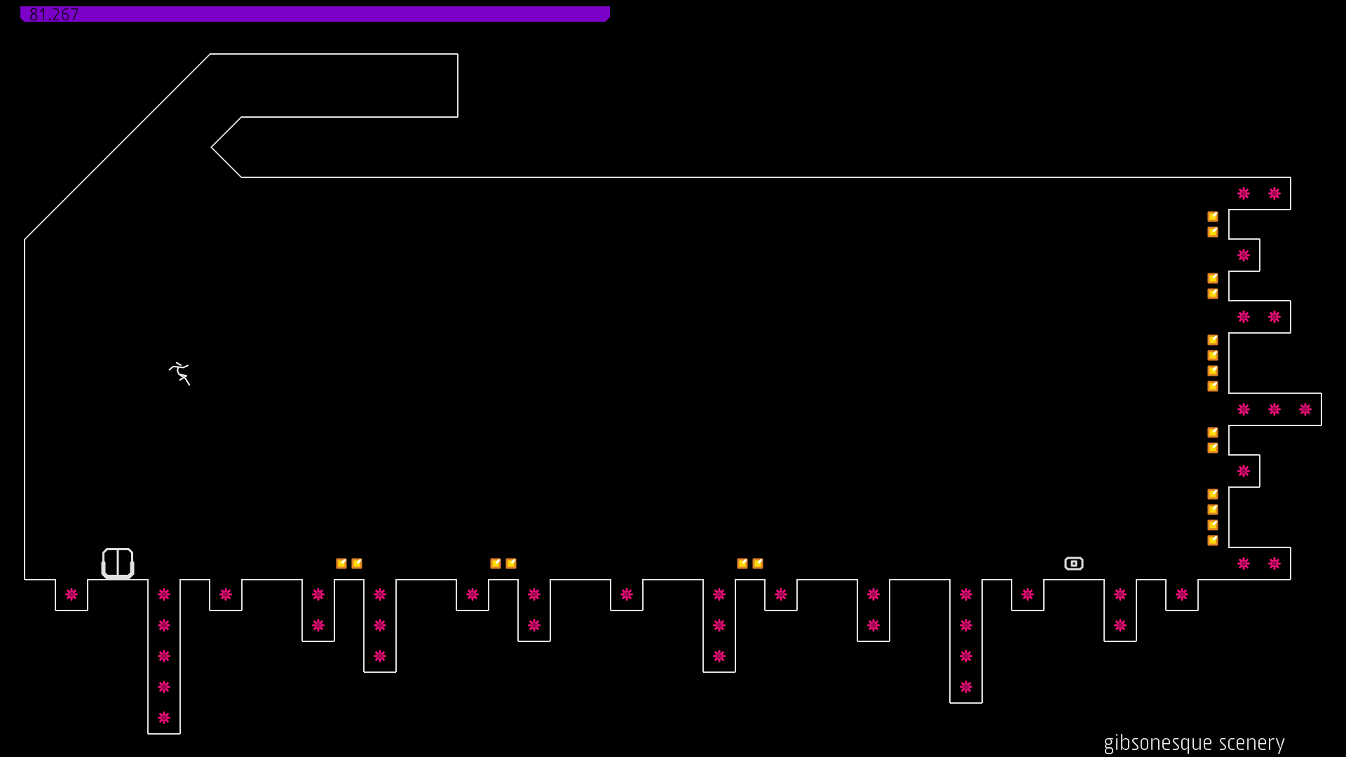
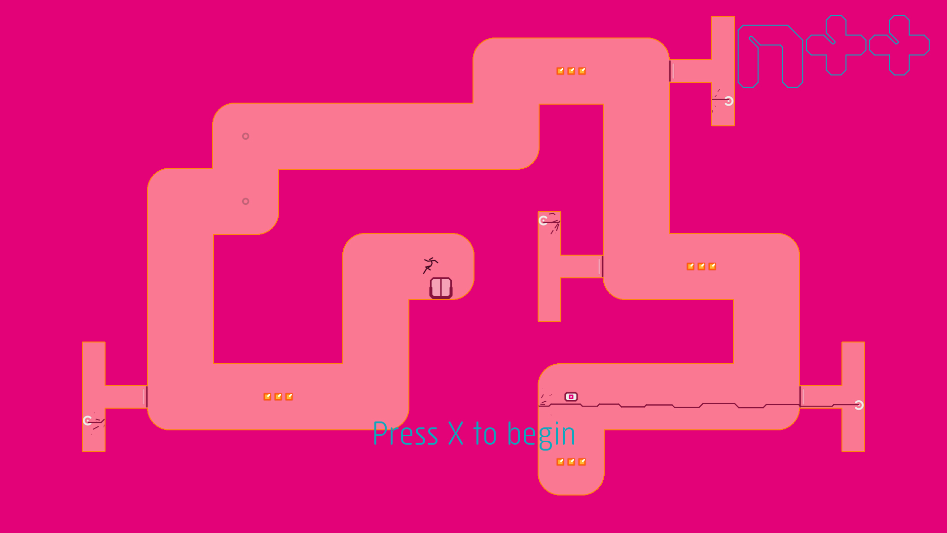
One of the main inspirations for the look of N++ was print-based graphic design: bold, smooth blocks of colour with crisp, sharp edges.
We wanted something that looked and felt different from other games — something simple but refined. In order to make this vision a reality, we needed two things: a style, and the technology necessary to support it.
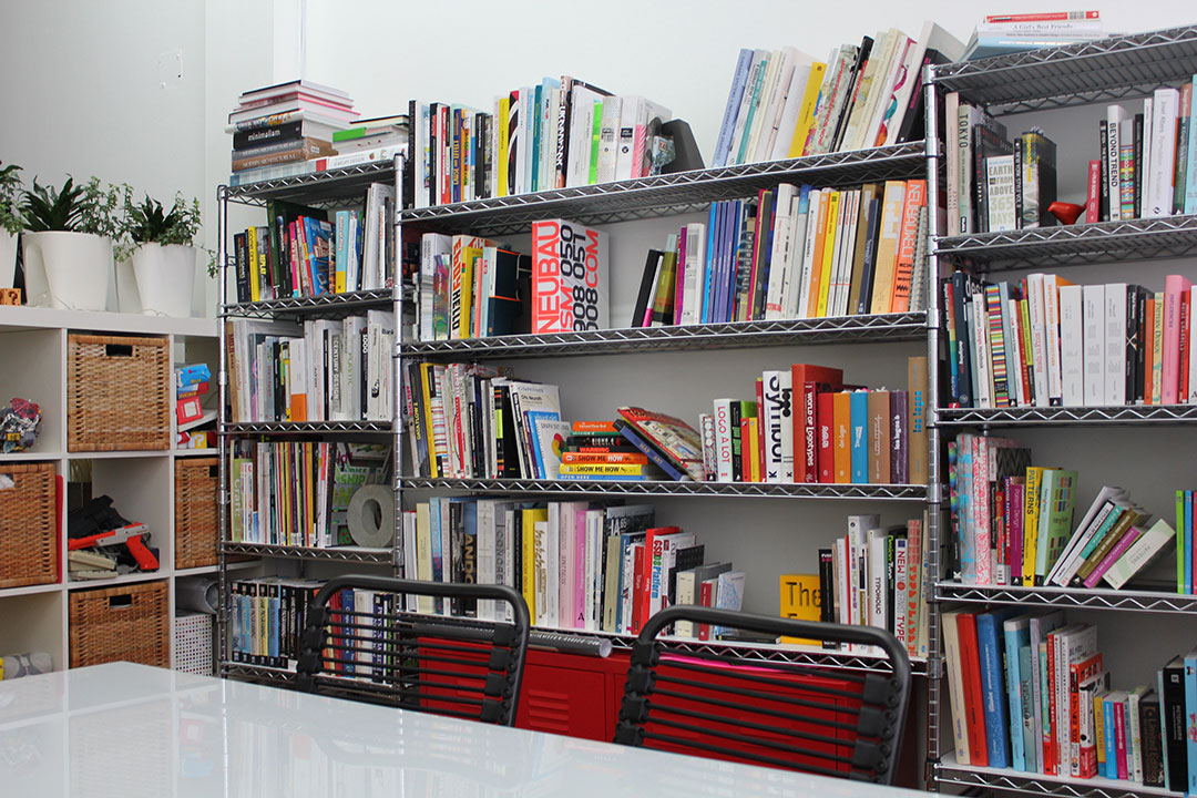
We at Metanet Software have always loved graphic design, especially in print. In fact, we have a rather large library of design books we frequently pore over.
It has always been a dream of ours to work with one of our favourite designers, and — thanks in part to Sony’s support via the Pub Fund program — we were able to finally realise this dream with N++, and team up with graphic designer MASA. We became aware of MASA through a book called ‘Latino’, released in the early 2000s by our favourite publisher, Gestalten.
So, over the course of the summer of 2013, we worked with him to define and refine the visual style of N++; the entity shapes, level treatments and some colour inspirations, menus/UI, and of course the logo. This took a lot more time and effort than we had anticipated; what was originally going to be a matter of weeks turned into a matter of months, as we iterated again and again, trying to find the right direction.
“We wanted something that looked and felt different from other games — something simple but refined.”
We knew we wanted the graphics to be reminiscent of N and N+, but totally taken to a new level. We just didn’t know what that level looked like, exactly. MASA really pushed us out of our comfort zone and forced us to really think about what it was that we wanted; we ended up learning a lot during that summer which informed the rest of development.
In the end we arrived at something that we’re really proud of — a pared-down clean style which looks as smooth as the game feels.
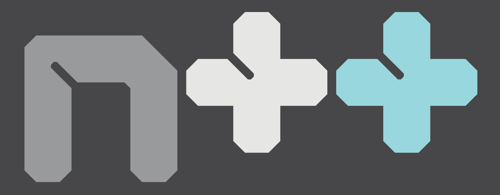
The logo itself was one of the hardest aspects to nail down; for N+ we simply used the same pixel font as we had with N, but this time we wanted something different — something that was less square, more dynamic, and vaguely techno-futuristic.
(You can see some of the in-progress attempts here)
“One of our primary inspirations was Wim Crouwel; his abstract typography is immensely beautiful.”
One of our primary inspirations was Wim Crouwel; his abstract typography is immensely beautiful. We thought that Crouwel’s modular grid-based designs were a perfect fit for the game; initially we stuck very close to the reference material. This resulted in a logo which was quite blocky, similar to the N and N+ logos, and maybe a bit too derivative.
MASA kept going, making something that we think truly stands on its own; a much more striking, intriguing, and evocative design:
Once we had the visual style defined, we then had to develop the technology to draw it; it’s fine to be inspired by the clean lines of high-DPI print, but getting that look on a low DPI monitor or TV requires some graphical wizardry. Luckily we have the amazing Shawn McGrath programming N++, and if anyone is a graphical wizard, it’s him. (He made Dyad, which you should check out on PSN.)
POTENTIALLY BORING PROBABLY INACCURATE TECHNICAL ASIDE:
If you’ve ever wondered why graphics are often jaggy and aliased, it’s because of how the colour of each pixel is calculated: a single sample is taken in the center of the pixel, and that colour is used for the entire pixel.
This is nice and easy, but it means that if a pixel is covering two objects — one black, one white — the result will be either a black or white pixel, rather than a mix of both colours. This results in nasty shimmering, stair-stepping, and ugly ropey-looking lines.
EVEN LESS TECHNICAL ASIDE:
It’s sort of like we’re trying to guess the volume of a shape by poking our finger in its direction while blindfolded.
With one poke, you can tell whether it’s there or not, hit or miss, on or off. With two pokes, you can differentiate between two different volumes (two hits means it must be big; one hit, small; zero hits means there must not be anything there). Basically, the more times you sample it, the more accurate an estimation you’re able to make.
One simple way to combat this problem is to take more than one sample per pixel – multi-sample anti-aliasing (MSAA) takes a series of samples inside each pixel, and then averages the results to produce an anti-aliased image.
Unfortunately, even lowly 4x MSAA means drawing the entire scene four times per frame (quadrupling the amount of work)… and it’s nowhere near the quality level we were shooting for.
So anyway, we decided to go crazy and write our own custom vector renderer.
The shapes we want to draw are defined geometrically, and a pixel’s colour is determined by how much of each piece of geometry overlaps it. This is a huge number of calculations, since it has to be done once for every pixel for every layer (most things in N++ are made of 4-8 layers); this also means generating a lot of geometry — each frame of N++ is made of up to 1,703,936 triangles! The result is immaculately smooth anti-aliasing, which runs at a flawless 60fps/1080p. As far as we can tell, it’s equivalent to 256x MSAA!! (Or more – Shawn insists that it’s equivalent to 4,294,967,296x MSAA, and I guess he should know since he programmed it, but Shawn is often prone to hyperbole, and so although we actually do agree that theoretically it may be 2^32x MSAA, for the sake of avoiding any possible false advertising, we’ll go with the lower bound. Either way, the point is: it looks amazing.)
“Each frame of N++ is made of up to 1,703,936 triangles!”
Bespoke vector rendering was at the top of our list of priorities for N++, because smooth graphics make the smooth gameplay feel even better. So, we’re really happy this worked out. Thanks Shawn!
The process for getting the geometry into the game is quite involved: working from our designs (vector shapes made in Illustrator or Flash), Shawn defines each vertex as code.
That’s right — N++ has hand-crafted artisanal vector graphics.
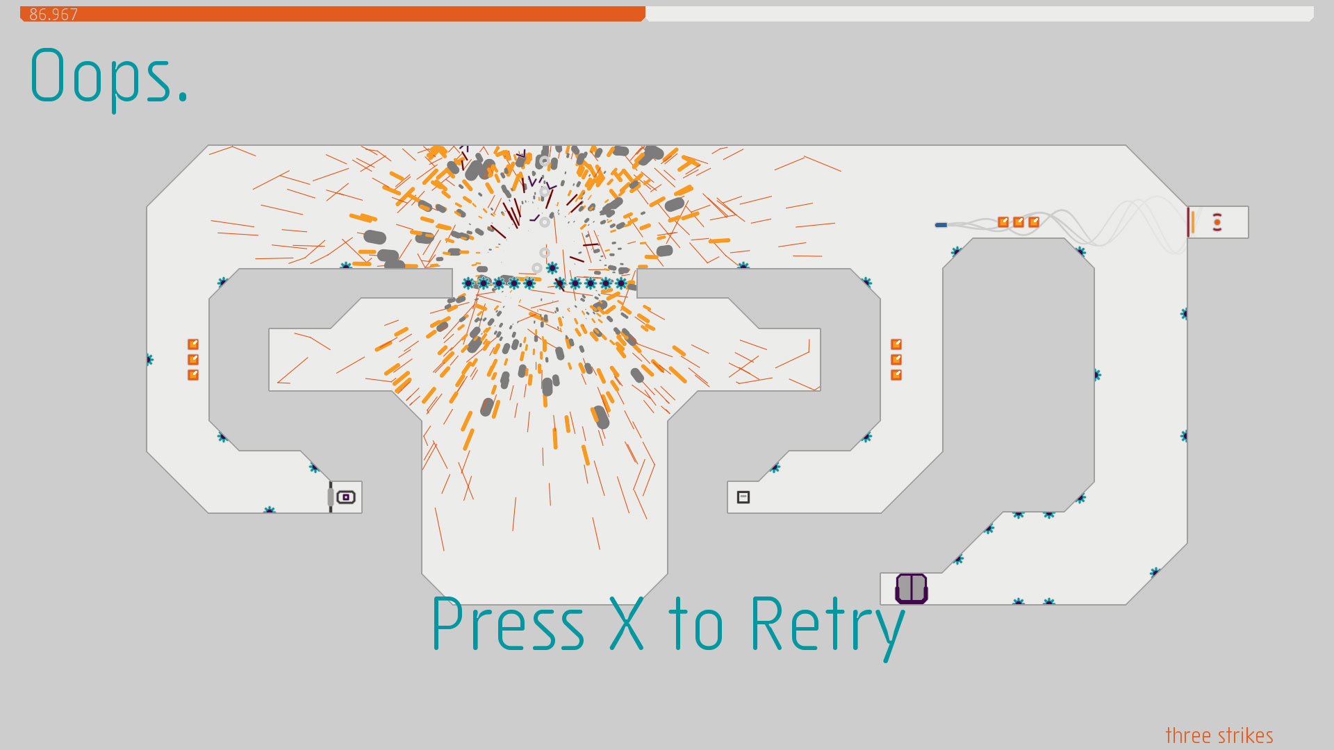
An important part of making a game feel right is visual effects, to make in-game events have more impact and to really “sell” the simulated world.
We wanted the effects in N++ to look a bit different than the usual “bunch of alpha-blended particles”; they had to work with our print-inspired style. In the end, we developed two different families of effect, “waves” and “particles”.
Waves are a strange parametric 45-degree-waveshape, a chain of zig-zagging lines which create a cool geometric shape; these are what we use for electrical “zaps”, laser beams, and other long linear effects.
Particles are our twist on a classic; we sweep them along their velocity to create capsules (thick line-segments), and then collide them against the world, so that they bounce around and dissipate; this really helps to make things like explosions, dust, and blood feel a bit more chaotic and real. Plus the bouncing looks really cool.
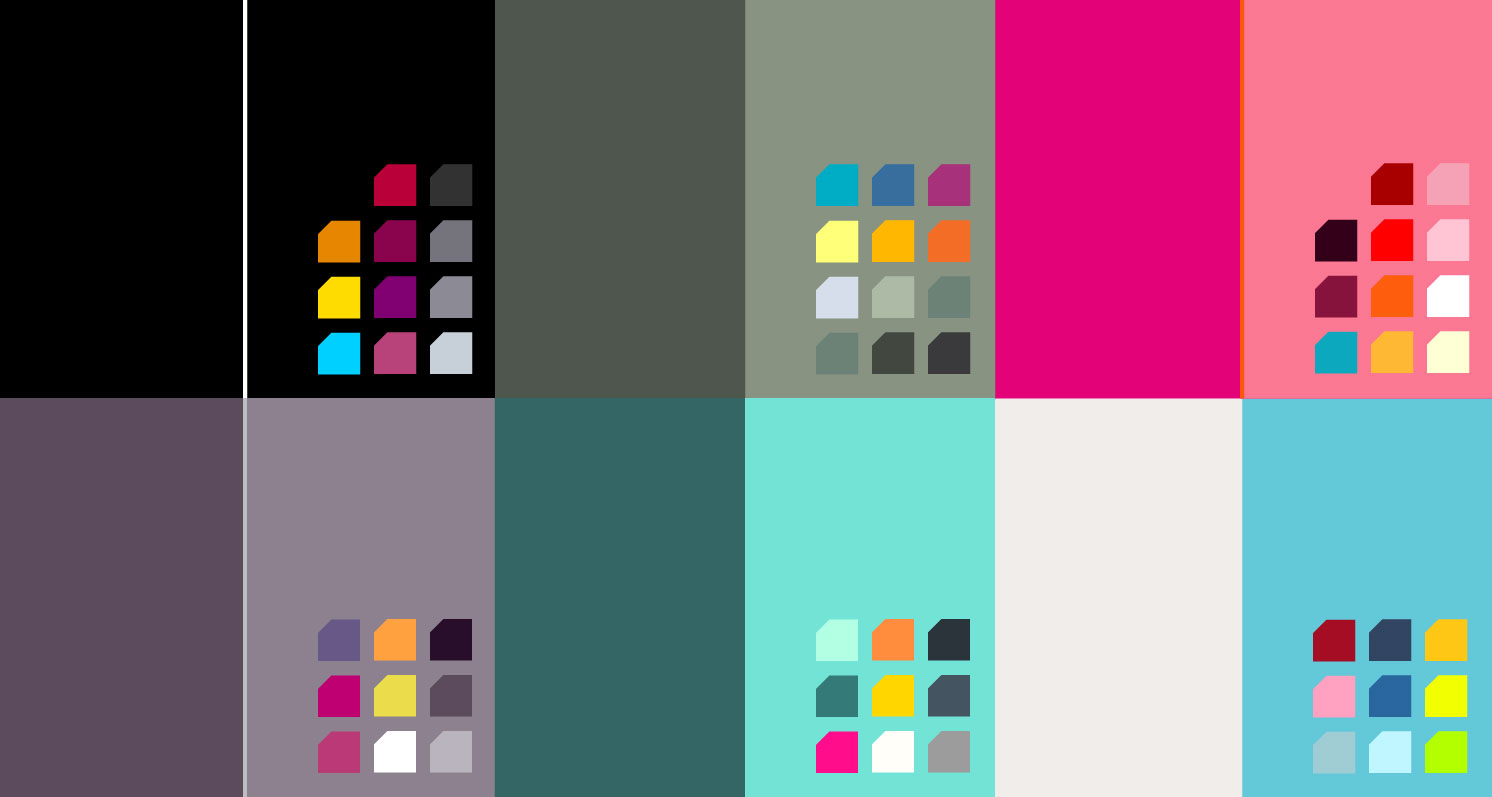
The final piece of the graphical puzzle was colour; while the neutral grey of N and N+ is extremely functional, we wanted to move beyond that and try something a bit more dynamic and exciting.
It was obvious from the start that, because of the modular nature of the game, and the fact that colours are extremely subjective, it would be best to provide players with a range of options so that everyone could find something that they liked. (Also, don’t worry — there will still be some highly functional neutral grey schemes to choose from in N++)
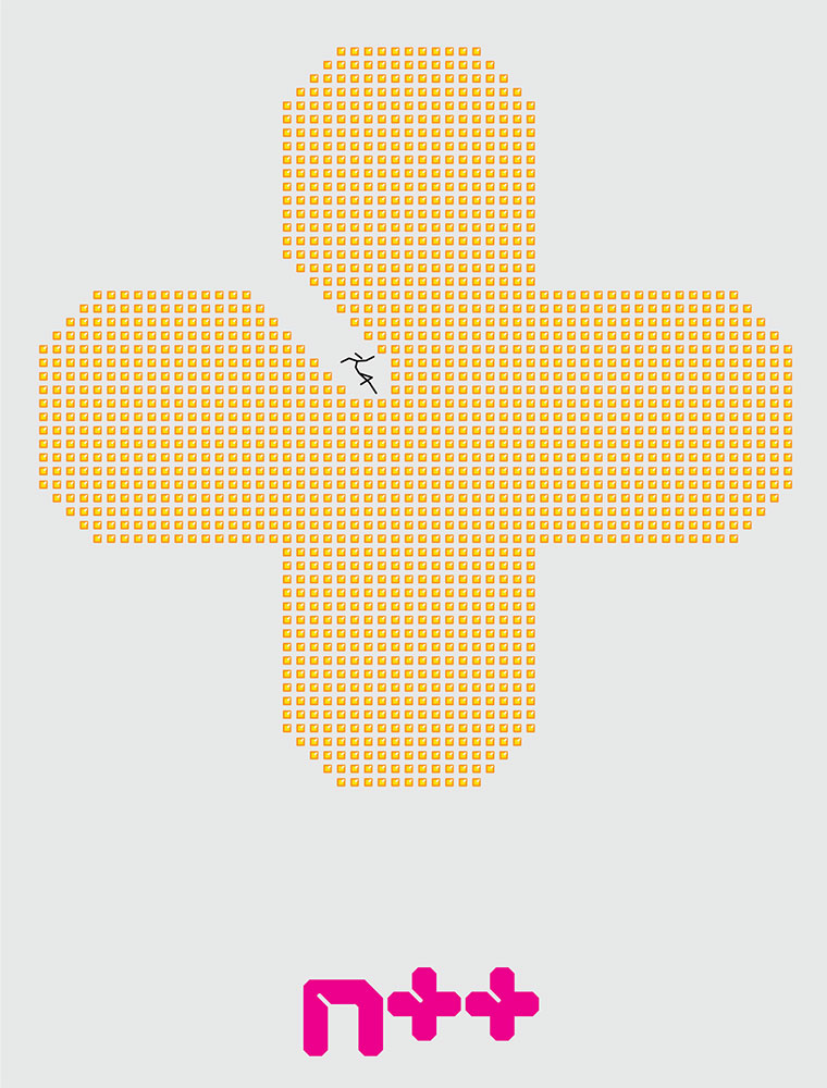
Our friend Lisa Harrison helped us to add to and expand upon our initial set of colour palettes; she’s also responsible for the awesome image on our promo postcards:
“We tried to design the visual aesthetic to minimise the mental burden on the player, freeing up mental resources for playing”
You’d think adding colour is easy, since the minimal style means the graphics are relatively simple, but it’s actually a complex task — for one thing, each colour scheme contains more than 100 individual colours! Tweaking each of the colours to balance brightness and visual interest, and making sure nothing looks off, is a big task.
Our strategy for the colours is generally to keep gold in the yellow family, mines in the red family, and to be consistent with “danger” and “safe” colours; our goal is to structure the graphics in order to create a visual language that players can learn how to “read”. Because N++ requires thinking on one’s feet, we tried to design the visual aesthetic to minimise the mental burden on the player, freeing up mental resources for playing and going with the flow of the ninja.
Whew, that was longer than we anticipated! Hopefully you now have an appreciation of how involved something as simple-looking as N++ can be; minimalism is hard work!
Thanks for reading :)

Join the Conversation
Add a CommentBut don't be a jerk!
13 Comments
Loading More Comments