With Airship Syndicate’s RPG Battle Chasers: Nightwar finally releasing on PS4 next week, we asked its creative director – and lead concept artist – Joe Madureira if he’d open the art team’s portfolio to showcase just some of the phenomenal work they’ve created over the course of the game’s development. Here are just 20 of their personal picks.
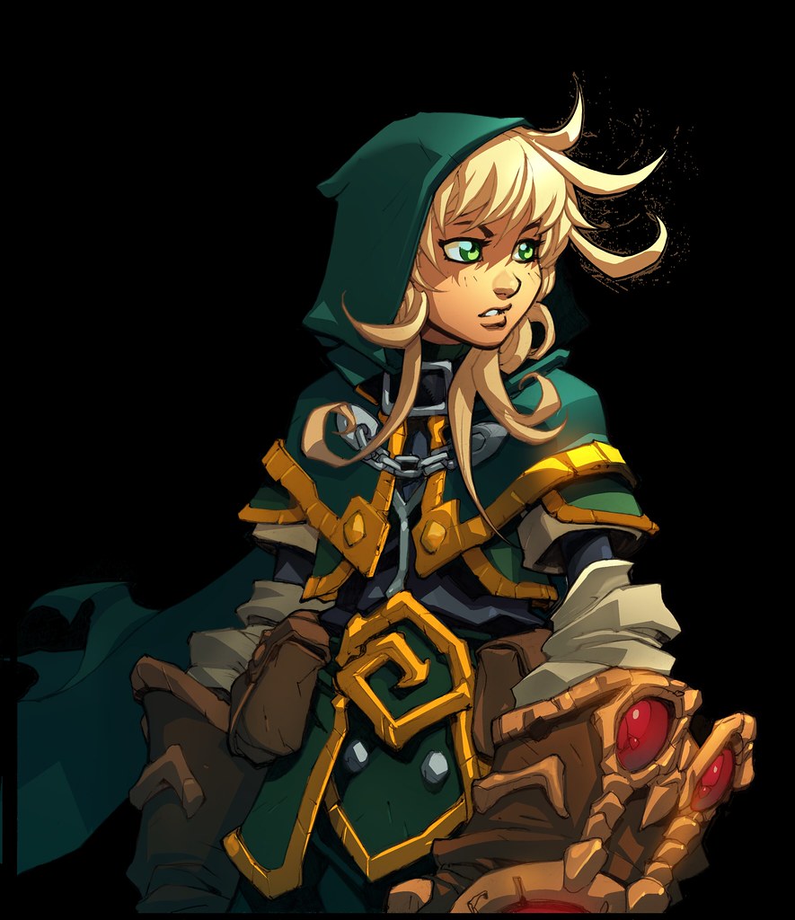
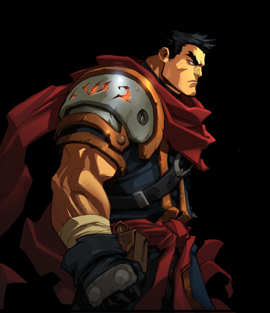
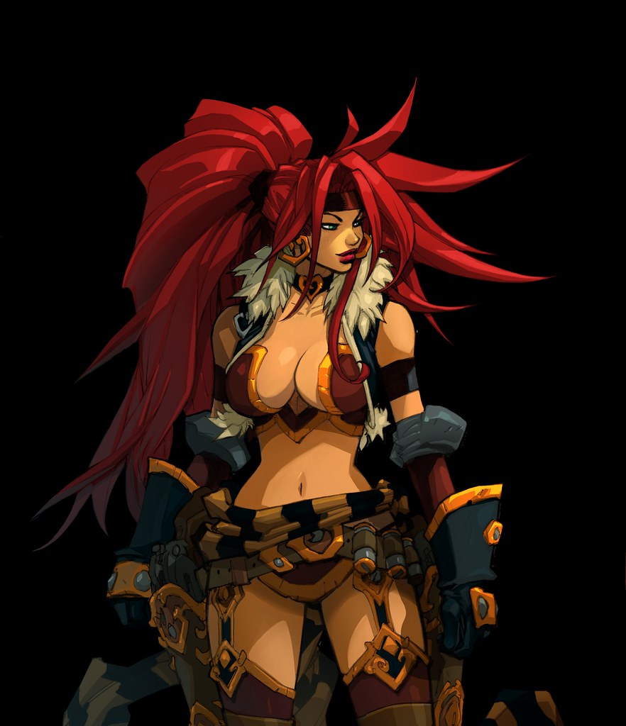
1. “We decided early on that our conversations in game would happen via ‘dialogue portraits’, just like the classic JRPGs of old, and it was really fun creating these for all the heroes and town NPCs. In some cases I did them before the actual concept for the 3D character, so I was updating their design on the fly as I did these. For Gully, I wanted her to look slightly more grown up and combat ready than she was in the comics. I flipped the hood of her green cloak up, and ditched the shorts she originally wore.” – Joe Madureira2. “Garrison, the stoic swordsman. Looking stoic. He probably stayed the closest to his original design.” – Joe Madureira 3. “Had a lot of fun with Red Monika’s design update. As the rogue of the party, I wanted her to be a little more sleek and agile. We knew she’d be flipping around, firing guns in midair, etc. For that reason, I made some changes to her original ‘proportions’, while trying to keep her seductive, sexy energy. Funny enough, these changes upset some people.” – Joe Madureira4. “Knolan, grumpy as ever, also remains fairly unchanged from his original design.” – Joe Madureira5. “The Devilhunter Alumon is a new hero introduced in Nightwar. He’s a mysterious character that taps into dark magic, and I wanted him to look like he could possibly be a villain at a glance. His entire look reflects that, especially the mask, which he never removes.” – Joe Madureira6. “This is an alternate version of our splash art, featuring my line work and Grace Liu’s awesome colours. It took me way too long to draw, and I kept running out of room on the paper I was using, so it ended up being several sheets of 11×17 boards taped together. Which made it a nightmare to work on and scan. Learned a few lessons with this one!” – Joe Madureira 7. “This first piece of splash art for Nightwar was also my first time drawing these characters in many years. Christian Lichtner, who was one of the original colourists of the Battle Chasers comic series painted it up, which makes it even more special for me!” – Joe Madureira8. “We knew there just HAD to be an airship in this game somewhere! This combat background was painted by Phu Giang.” – Joe Madureira9. “This was the first combat background I painted for Battle Chasers, starting from a thumbnail Joe doodled. It was inspiring and amazing how much it helped just having those cool shapes and a central idea as a starting point.” – Grace Liu 10. “The initial sketch I did for the junkers and bandits that plague the BC heroes on their island adventure. Because we’re a relatively small team with limited resources, we often have to create multiple variations out of a single creature, so I’ll occasionally throw down any ideas that occur to me when I’m concepting the base character.” – Joe Madureira11. “I created this image during our Kickstarter. It was for the reveal of our second dungeon, set in watery caves. That dungeon went through quite a few changes but ended up including a lot the atmosphere and ideas in this image.” – Jesse Carpenter12. “One really fun thing about Battle Chasers is that sword and sorcery coexists with technology, so it’s not uncommon to encounter giant, machine-gun wielding robots along with more traditional monster types.” – Joe Madureira13. “This concept was fun because it started as a quick experiment to see how quickly we could transform some of our existing assets into something new. It ended up being used for the underground areas in Deadwatch, transitioning from the storm outside. Before this experiment, Deadwatch was planned to be a rainy dungeon set outside.” – Jesse Carpenter 14. “Large splash art and character illustrations are great, but I also really love drawing the small things. Piles of skulls. Rocks. Trees. These small details can help give the environment a lot of personality.” – Joe Madureira15. “This is another case of how much it helped to have good art direction and that extra push. It was really fun to help visualizing a vibrant world full of wonder.” – Grace Liu 16. “The town of Harm’s Way. This illustration by Nicola Saviori is so beautiful, that for a while we were planning to use it as the ‘Town Screen’, or interface for accessing all the town NPCs. We ended up building out the town as part of the world map, but it’s still one of our favourite images from the game.” – Joe Madureira 17. “I really wanted each NPC in the town of Harm’s Way to be memorable visually, beyond the typical merchants you’d find in an RPG. Many of them aren’t even human.” – Joe Madureira18. “The Collector. One of my favourites! I’ve always loved the concept of the shady merchant.” – Joe Madureira19. “Dogan, the barkeep with a colourful past. If you look closely at his tats, you may notice a familiar symbol…” – Joe Madureira20. “The lions were a lucky accident. I was doodling the beast heads when Joe asked me if they were lions, since the beastmaster looks like a lion. I said yes.” – Grace Liu


Join the Conversation
Add a CommentBut don't be a jerk!
5 Comments
Loading More Comments